Adding & managing templates with SeoToaster
Adding and managing templates in SeoToaster is very simple. You can add a template in a few clicks and find it back whenever you need it.
Creating templates is also very easy. It uses simple HTML and Content Widgets to add a content area to the page.
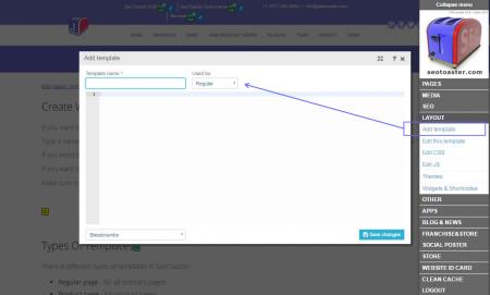
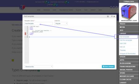
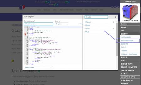
If you want to add a new template to your website, click on Layout -> Add template on the admin panel.
Type a name for your new template and choose a type of the template from the dropdown list. Paste your HTML code and click "Save".
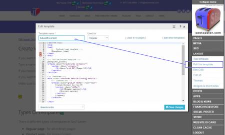
If you need to edit this template go to Layout -> Edit this template.
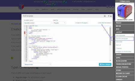
If you want to edit another template, click "other templates" and you will see the list of all your templates.
Tutorial: How to manage templates
Types of templates in SeoToaster
There 8 different types of templates in SeoToaster, with specific uses:
- Regular page - for all ordinary pages
- Product page - for product pages
- Checkout page - to perform checkout process
- Product listing - to make nice list of your products
- Email sending - to make beautiful auto-reply email for your customers
- Thank you page - to create a nice-looking after-purchase page
- Quote - to create quotes
- Customer landing page - to add a page where customer is redirected after log in
Basic meta tags for your templates
Your template must contain basic Meta tags.
To do this, use the following tokens and they will be filled automatically when you will create a page based on the template, and enter these required information in the Page Properties.
{%%page:title} , {%%meta:keywords}, {%%meta:description}
Your template code for meta tags should then look like this:
<title>{%%page:title}</title><meta name="keywords" content="{%%meta:keywords}" /><meta name="description" content="{%%meta:description}" />
CSS files & codes for your templates
Once you've inserted the code for Meta Tags, you should connect CSS files.
CSS stands for Cascading Style Sheets, and the CSS files describe how various content and HTML elements should be displayed in your web pages.
To simplify your code make your templates lighter, SeoToaster uses "external stylesheets" that are stored in the following CSS files, of which only the first two are required.
- style.css - used for general styles.
- content.css - CSS used for text and special styles for your content.
- nav.css - Defines the styles for different types of navigation menus.
- products.css - Defines the styles for product listings and product pages (for SeoToaster Ecommerce).
To help reduce browser inconsistencies (default line heights, margins, headings font sizes, ...), we've included in SeoToaster a CSS file called reset.css which contains all the necessary styles for the 960 Grid System (read more about that further below).
Your template code for CSS files should look like this, preferrably in this order:
<link href="reset.css" rel="stylesheet" type="text/css" media="screen" /><link href="style.css" rel="stylesheet" type="text/css" media="screen" /><link href="content.css" rel="stylesheet" type="text/css" media="screen" /><link href="nav.css" rel="stylesheet" type="text/css" media="screen" /><link href="products.css" rel="stylesheet" type="text/css" media="screen" />
There are other CSS classes we use every day to simplify the code, and our life! We thought we might share them to make your life easier too.
CSS Classes for Rounded Corners
You can apply these CSS classes to any content block and it will get rounded corners..roundedtop, .roundedbottom, .rounded3px, .rounded5px
CSS Classes for Indentation
You can apply these CSS classes to add different types of indentation for the following attributes: mt - margin-top; mb - margin-bottom; ml - margin-left.mt5px, .mt10px, .mt20px, .mt30px .mb5px, .mb10px, .mb20px, .mb30px .ml10px, .ml20px, .mr10px, .mr20px .padding5px, .padding10px
Using the 960 Grid System for simpler templates
The 960 Grid System - aka 960 GS - provides a fast and easy way to create grid-based layouts using CSS, as well as providing cross-browser-tested, and optimized preset column widths to set your content into.
Structure of 960 GS
- Total width: 960px
- 12 columns by 60px each - or - 16 columns by 40px each
- Each column has 10px left and right margin
To create an object in your layout that spans the width of one or several columns, you just need to use the appropriate class.
Read more about 960GS: http://960.gs/.
See a demo of location columns: http://960.gs/demo.html.
SAMPLE CODE: Simple Template Using 960 GS
<!DOCTYPE html>
<html lang="en">
<head>
<meta http-equiv="Content-Type" content="text/html; charset=UTF-8"  />
<title>{%%page:title}</title>
<meta name="keywords" content="{%%meta:keywords}" />
<meta name="description" content="{%%meta:description}" />
<meta name="generator" content="seotoaster" />
<link href="reset.css" rel="stylesheet" type="text/css" media="screen" />
<link href="style.css" rel="stylesheet" type="text/css" media="screen" />
<link href="content.css" rel="stylesheet" type="text/css" media="screen" />
<link href="nav.css" rel="stylesheet"  type="text/css" media="screen" />
</head>

<body>
<div id="container" class="container_12">

 <!-- Header -->
 <header class="grid_12">
 <h1 class="logo">
 <a href="{%%website:url}" title="" class="logo">
 <img src=https://www.seotoaster.com/themes/seotoaster-2015/images/logo-small.jpg width="112" height="130" alt="seotoaster">
 </a>
 </h1>
 <nav>{%%menu:main}</nav>
 </header>

 <!-- Main Column -->
 <div id="content" class="grid_9">
 <h2>{%%header:content}</h2>
 {%%content:content1}
 </div>

 <!-- Right Column -->
 <div id="right" class="grid_3">
 <h3>{%%header:right1:static}</h3>
 {%%ontent:right1:static}
 </div>

 <!-- Footer -->
 <footer class="grid_12">
 {%%content:footer:static}
 <nav>{%%menu:flat}</nav>
</footer>
</div>
</body>

</html>

